Why Does Online Furniture Color Often Look Different?
Color discrepancy remains one of the most frustrating challenges in online furniture shopping. Many homeowners have felt disappointed after getting a beautiful dining set or kitchen accent piece. They often find it looks drastically different from the online photos they saw. This issue with furniture color affects items like bar stools and kitchen cabinets. It often leads to expensive returns and delays in renovations.
The problem comes from several factors. These include differences in digital screens, lighting conditions in photography, and how various materials interact with light.
What looks like a warm, inviting honey oak on your laptop screen may come as a cool, yellow wood. This color might not match your current décor. That perfect sage green you loved online might look blue or grey in your kitchen.
In kitchen colour schemes, the stakes become even higher. Your kitchen is not just another room, It's the heart of your home. A place where families gather, you prepare meals, and you make memories. Unlike a living room chair that you can move or change easily, kitchen renovations take a lot of time and money. A poorly chosen kitchen colour can affect your daily mood, impact your home's resale value, and require expensive corrections.
This guide will help you with challenges which help you choose kitchen color schemes that look great online and in your home. You will learn how your kitchen's unique conditions affect color perception. You will also avoid common "color trap" mistakes. Discover professional techniques to create a kitchen that shows your style and improves your daily life.
Step 1: Evaluate Your Kitchen's Space
Choosing the right kitchen colour starts with understanding your kitchen's physical attributes. Color is not just about looks. It interacts with light, layout, and size. This shapes how your space feels and works at different times of the day.
Kitchen Size Matters: Strategic Color Selection
The relationship between kitchen size and color choice represents one of the most critical factors in successful kitchen design. Knowing this relationship helps you avoid common mistakes. These mistakes can make your space feel cramped, overwhelming, or disconnected from your home's style.
Small Kitchen Color Strategies
In small kitchens, dark colors can feel heavy. They can make the room look even smaller than it is. This happens because dark surfaces absorb light instead of reflecting it. This creates a visual weight that can make small spaces feel cramped and claustrophobic.
Professional designers suggest using light, reflective colors. Good choices are pale grey, soft white, or muted beige. These colors can help make your space look bigger. These strategic kitchen colour choices work by:
- Maximizing light reflection: Light colours bounce natural and artificial light around the room, creating the illusion of greater space
- Creating smooth look: Consistent light tones eliminate visual breaks that can make small spaces feel fragmented
- Enhancing vertical perception: Light colours on walls and upper cabinets draw the eye upward, making ceilings appear higher
Consider these specific small kitchen combinations:
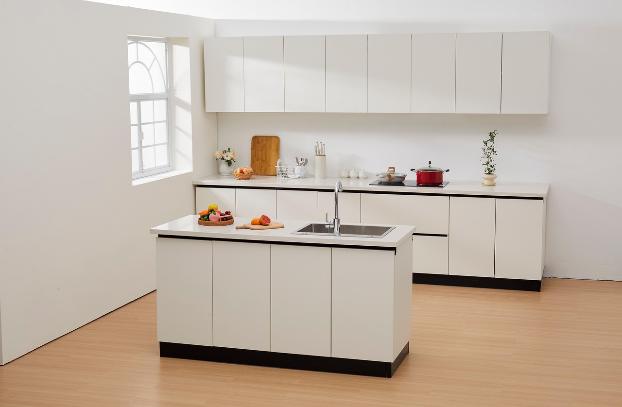
- Soft white cabinets with light grey backsplash and white countertops
- Pale sage green lower cabinets paired with crisp white upper cabinets
- Warm cream cabinetry with natural wood accents and brass hardware
Pro Tip: In galley kitchens, use light colors on the longest walls. This creates a feeling of width. Use slightly darker tones on the shorter end walls. This adds visual interest without making the space feel crowded.
Large Kitchen Color Opportunities
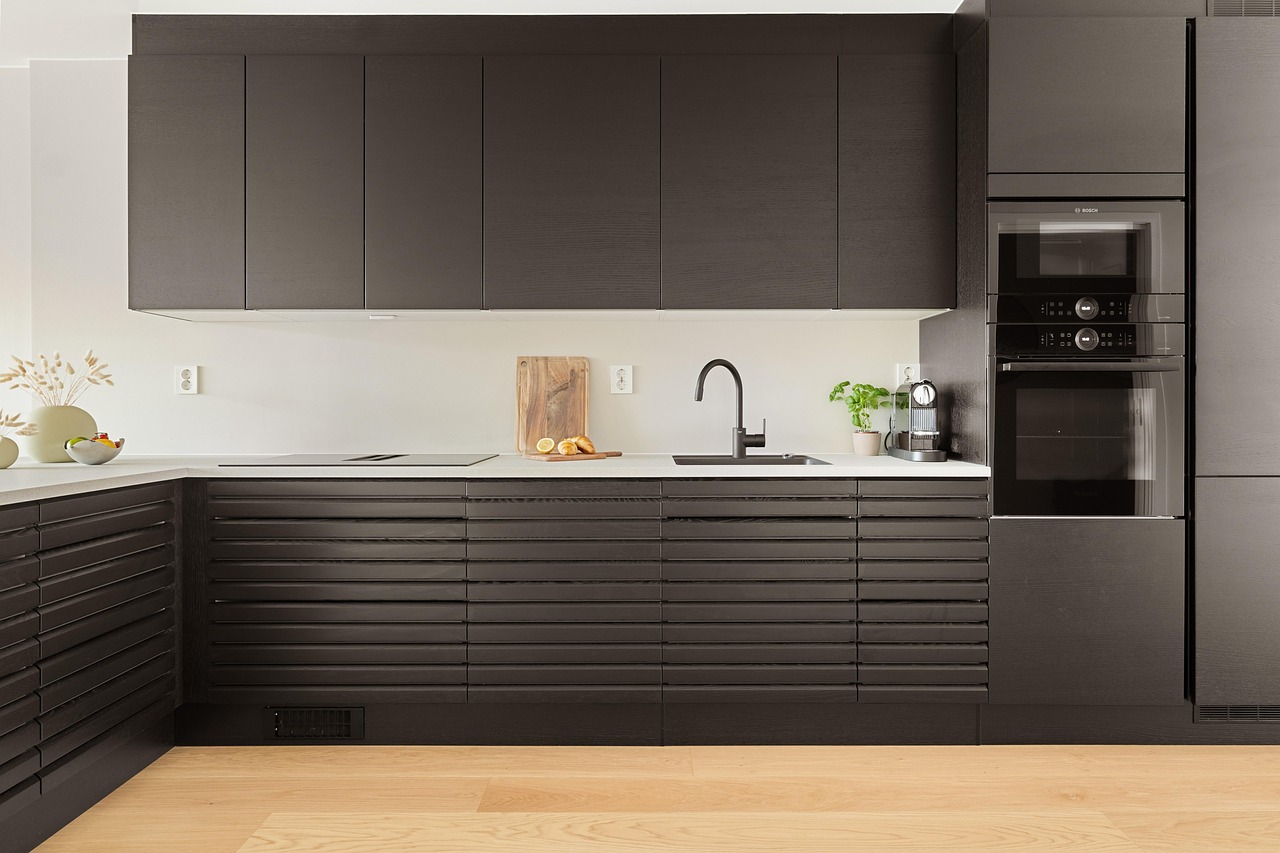
Larger kitchens, on the other hand, can handle more depth and drama in their colour schemes. Rich navy, forest green, or charcoal tones add a sophisticated edge when balanced with lighter countertops or flooring. These bold kitchen colors create a warm and stylish atmosphere. They help large spaces feel less cold and impersonal.
Successful large kitchen combinations include:
- Deep navy cabinets with white marble countertops and brass fixtures
- Forest green kitchen islands paired with warm white perimeter cabinets
- Charcoal grey lower cabinets with natural wood upper cabinets
Consider Your Lighting: The Science of Color Perception
Lighting plays a critical role in how colours are perceived throughout your kitchen. Natural light changes during the day. Artificial lighting, like warm or cool bulbs, can greatly change the look of your paint or finish.
North-facing kitchens tend to feel cooler and may benefit from warmer colour palettes. These spaces receive consistent but cooler natural light, making warm kitchen colour tones essential for creating an inviting atmosphere.
South-facing kitchens can handle cooler tones as they receive abundant warm natural light throughout most of the day. This generous light exposure allows for more flexibility in kitchen colour schemes.
Mixed lighting environments require careful testing. Always evaluate color samples under both daylight and your planned artificial lighting to ensure consistency and avoid unpleasant surprises.
Don't Ignore Adjacent Spaces: Creating Flow
If your kitchen is part of an open-plan layout, your kitchen colour scheme should harmonize with the living and dining areas. This doesn't mean everything must match perfectly , but transitions should feel smooth and intentional.
Successful Open-Plan Color Strategies:
- White and wood-tone kitchens flow easily into Scandinavian-style living rooms
- Grey or greige tones work beautifully with modern or industrial décor
- Warm cream and natural wood create seamless transitions to traditional family rooms
The key is to keep a consistent tone (warm or cool) in connected spaces. Each area can still have its own unique personality.
Step 2: Understand How Colors Look in Real Life
Colors may appear slightly different in person because of lighting, screen settings, and material textures.

Screen Display vs Physical Reality
Digital screens display colors using RGB (red, green, blue) light combinations, while physical surfaces reflect ambient light. This key difference means that the bright teal cabinet you see online may look more muted or grey in your kitchen.
Material Texture Affects Color
Different materials with light affecting how colors appear:
Glossy surfaces reflect more light, making colors appear brighter and more saturated. High-gloss kitchen cabinets will look more vibrant than their matte counterparts in the same color.
Matte finishes absorb more light, creating deeper, more muted color appearance. Matte kitchen colour choices often appear more sophisticated but may look darker than expected.
Textured surfaces create shadows that can make one color look like it has different shades. This depends on the angle you view it and the lighting.
Smart Strategy for Online Furniture Shopping
- Check product dimensions carefully and measure your space before purchasing
- Review product descriptions in detail—pay attention to materials, finishes, and textures
- Read customer reviews and look at real-life photos when available
- Zoom in on product images to see textures and finishes clearly
- Compare colors on different screens to get a more accurate idea
- Reach out to customer service if you have any doubts or need advice
Step 3: Match Color with Style and Mood
The color of your furniture can set the tone for your kitchen; whether you're going for cozy farmhouse charm or clean, modern lines. Here’s how to match furniture colors with your kitchen’s overall mood:
Minimalist Kitchen Style
Trendy kitchen colors for minimalist designs focus on clean, uncluttered palettes:
- Pure white cabinets with black hardware
- Light grey throughout with natural wood accents
- Gentle shades of the same color creates a calm, modern

Country/Farmhouse Kitchen Style
Country kitchen color inspiration draws from natural, earthy palettes:
- Warm whites and creams
- Sage green and soft blue accents
- Natural wood tones and vintage brass fixtures

Nordic/Scandinavian Kitchen Style
Nordic kitchen colour schemes emphasize light, airy, and functional beauty:
- Crisp whites and light grays
- Natural wood and black accents
- Minimal color with maximum impact through texture

Industrial Kitchen Style
Industrial kitchen style combines raw materials with sophisticated color choices:
- Charcoal grey and black primary colors
- Raw steel and concrete textures
- Warm wood accents for balance
Step 4: Be Inspired - Popular Kitchen Color Schemes That Never Go Out of Style
Some kitchen colour schemes have proven their staying power through decades of design evolution. These classic combinations provide excellent starting points for your kitchen renovation.

White + Sage Green
This soft, nature-inspired duo brings calm and charm to even the smallest kitchens:
- Crisp white cabinetry with brushed metal handles
- Sage green accent wall with open wood shelving
- Marble-look countertop paired with fresh greenery and floral touches
Why it works: The fresh white brightens the space. The sage green adds warmth and a cozy, natural feel. This combination is perfect for a calm, lived-in kitchen vibe.

Gray + Matte Black
This bold, modern pairing delivers an ultra-sleek and sophisticated kitchen atmosphere:
- Concrete-look gray cabinetry with matte black hardware
- Matte black upper cabinets with warm wood accents
- Minimalist countertops with seamless integrated appliances
Why it works: The mix of industrial gray and deep matte black creates depth and drama. It also keeps a refined, modern elegance.
Black + Light Wood
This high-contrast pairing offers bold sophistication balanced with natural warmth:
- Matte black cabinetry with integrated grooves for texture
- White countertops for a clean, modern break
- Pale wood flooring softens the space and adds inviting warmth
Why it works: The strong difference between black cabinets and light wood creates a nice visual balance. It mixes modern style with a friendly, down-to-earth feel.
Inspiration Sharing: Country Kitchen Perfection with Haseeb Collection

The Haseeb counter stools show how the right furniture can improve your kitchen's color scheme. They also keep the true farmhouse charm.
In this beautiful country kitchen, the Haseeb stools have soft, neutral fabric and warm wood-like legs. They match perfectly with the classic white cabinets and elegant marble countertops. Paired with natural light and fresh flowers, this setup captures the relaxed elegance of a modern farmhouse kitchen.
Ready to Transform Your Kitchen?
Don't let furniture color accuracy concerns hold you back from creating your dream kitchen. Check out our wide range of kitchen furniture. We have cabinets, islands, bar stools, and storage solutions. Each item has accurate colors and detailed material descriptions.Visit our Kitchen Furniture Collection today!


